Leupold Scope History
Leupold Logos – Part 3: The Black & Gold Boom (1980s–1990s)
The 1980s ushered in a bolder, sleeker visual identity for Leupold. Gone were the serif fonts of the 1970s—in their place came a high-contrast, tall sans-serif “Leupold” wordmark that projected authority and modern precision. Paired with the emerging gold-on-black color scheme, this look formed the foundation of what would become Leupold’s enduring style into the…
Read MoreLeupold Logos – Part 2: The Golden Ring Era (1968–Late 1970s)
In 1968, Leupold entered a bold new era of identity with the introduction of the Golden Ring—a design element that would become one of the most recognizable scope markings in the industry. While core scope construction remained rugged and reliable, the outward branding became more intentional, with new logos, marketing themes, and scope engravings appearing…
Read MoreLeupold Logos – Part 1: The Portland Era (1940s–1968)
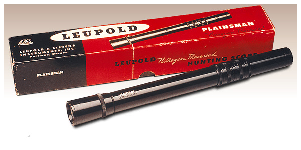
Before there were Golden Rings or crosshair icons, there was simply “LEUPOLD” – stamped cleanly and proudly onto scopes built in the early days of American sporting optics. This post begins our chronological exploration of Leupold branding, logos, and scope markings, starting with the Portland Era: a time when Leupold & Stevens was still finding…
Read More